
OLIPOP Ambient Product Line
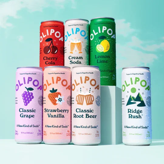
As Head of Design, I led the creation of OLIPOP’s ambient product line, expanding into new retail channels with mini and slim cans. The redesign improved shelf presence and flavor clarity, strengthening OLIPOP’s position in the functional soda category.
To support OLIPOP’s growth in convenience and grab-and-go channels, I helped develop the brand’s Sleek Can format — a 12oz, streamlined version designed to stand out in the cold case next to traditional sodas and energy drinks. The design maintained OLIPOP’s signature optimism and flavor-forward aesthetic while adapting to a vertical, high-impact layout that reads quickly at arm’s length. Clean typography, bold color blocking, and metallic finishes created a premium yet accessible presence, positioning OLIPOP as a modern alternative for impulse buyers in c-stores and quick-serve environments.

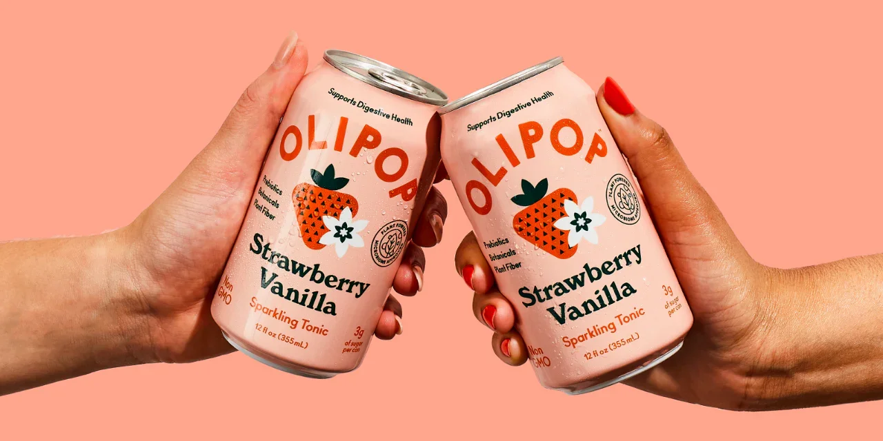
For OLIPOP’s 6-Pack redesign, I set out to elevate appetite appeal and flavor storytelling across the multipack format. By introducing illustrations that highlighted each flavor’s natural ingredients, the packaging gained a more vibrant and expressive presence on shelf. I also re-directed the product photography to feel fresh, tactile, and craveable — emphasizing color, condensation, and natural light to better convey taste and refreshment. The result was a cohesive, sensory-driven design system that made the 6-pack not just a bundle of cans, but an invitation to experience the brand’s flavor and optimism in every detail.


To expand OLIPOP’s presence in on-the-go and multipack markets, I helped design the Mini Pack format and graphic identity.— a playful, shareable 7.5oz version of OLIPOP’s core lineup. The design preserved brand recognition while emphasizing approachability and portion control, using scaled typography, simplified layouts, and lighthearted flavor cues. The result: a compact format that introduced the brand to new audiences and extended its retail shelf presence.


